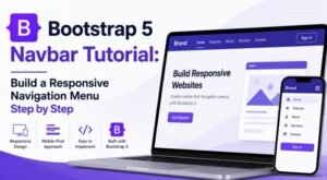
A complete, step-by-step guide to create a professional bootstrap 5 navbar with logo and bootstrap 5 navbar with brand name — covering sizing, responsive design, SVG vs PNG, flexbox alignment, positioning options, and polished real-world examples.
⬇ Download the Bootstrap 5 Navbar with Logo and Brand Name source code
Here is the complete source code — all 12 stages, every commit, every file — the link is in the description and pinned in the comments. Download it, open each stage folder in your browser, compare them side by side, see exactly what changes at each step.
Table of Contents
🚀Introduction
Your website’s navbar is the first thing visitors interact with. It anchors every page, sets the visual tone, and — when done well — communicates brand identity before a user reads a single word. A properly implemented bootstrap navbar with logo builds trust instantly and guides users intuitively through your site.
Why Branding Matters in Website Navigation
Navigation isn’t just about getting from A to B. It’s a branding surface. Studies in UX research consistently show that users form a first impression within 50 milliseconds. A crisp logo positioned in the navbar reassures visitors they are in the right place, reinforces recall, and creates consistency across every page.
- Trust signals: Logos in navigation signal legitimacy and professionalism.
- Brand recall: Repeated exposure to your logo across all pages cements visual memory.
- Navigation anchor: A logo linked to the home page is a universal UX convention users rely on.
- Hierarchy: The brand element naturally occupies the primary visual position, leaving secondary slots for nav links.
Benefits of Adding a Logo to a Bootstrap Navbar
Bootstrap 5 makes adding a logo remarkably straightforward. The .navbar-brand
component handles the structural heavy-lifting, and with a few lines of CSS you get a fully
responsive, accessible brand block that scales beautifully across all devices.
What You’ll Build
🧩Understanding the Bootstrap Navbar Brand Component
What Is .navbar-brand?
.navbar-brand is a dedicated Bootstrap 5 utility class applied to an
<a> or <span> element inside a .navbar.
It applies a set of default styles — font-size, font-weight, padding, and alignment — specifically
designed to house your brand identity: a logo image, a text name, or both combined.
<!-- Minimal .navbar-brand usage -->
<a class="navbar-brand" href="/">
  MyBrand
</a>Bootstrap’s default .navbar-brand styles include:
font-size: 1.25rem— slightly larger than body textfont-weight: 500— medium weight for readabilitypadding-top / padding-bottom: .3125rem— vertical centeringwhite-space: nowrap— prevents awkward line breakscolor: inherit— inherits the navbar’s text color scheme
How Bootstrap Handles Branding Elements
Bootstrap 5 uses flexbox throughout the navbar. The .navbar container is a flex
parent with align-items: center, which means any child element — including
.navbar-brand — is vertically centred by default. You don’t need extra CSS for
basic alignment; it’s baked in.
Pro Tip
.navbar-brand element. This keeps the entire brand block clickable as one unified home-page link — a UX pattern users expect.Navbar Brand vs Navigation Links
The .navbar-brand is semantically and visually separate from
.navbar-nav (your navigation links). They coexist inside
.container or .container-fluid and Bootstrap’s flexbox distributes
them automatically. The brand sits left by default; links fill the remaining space.
🏗️Create a Basic Bootstrap Navbar with Logo
Bootstrap 5 Navbar Structure
Before adding a logo, understand the full scaffold. A Bootstrap 5 navbar uses a specific nesting order that ensures correct responsive behavior and accessibility.
<nav class="navbar navbar-expand-lg navbar-dark bg-dark">
  <div class="container">

    <!-- 1. Brand / Logo -->
    <a class="navbar-brand" href="/">BrandName</a>

    <!-- 2. Mobile toggler -->
    <button class="navbar-toggler" type="button"
            data-bs-toggle="collapse"
            data-bs-target="#navMain">
      <span class="navbar-toggler-icon"></span>
    </button>

    <!-- 3. Collapsible menu -->
    <div class="collapse navbar-collapse" id="navMain">
      <ul class="navbar-nav ms-auto">
        <li class="nav-item">
          <a class="nav-link active" href="/">Home</a>
        </li>
        <li class="nav-item">
          <a class="nav-link" href="/about">About</a>
        </li>
        <li class="nav-item">
          <a class="nav-link" href="/contact">Contact</a>
        </li>
      </ul>
    </div>

  </div>
</nav>Adding an Image Logo
Replace the text inside .navbar-brand with an <img> tag.
Bootstrap automatically vertically aligns it within the brand container.
<a class="navbar-brand" href="/">
  <img
    src="/assets/logo.svg"
    alt="Company Logo"
    width="140"
    height="40"
    class="d-inline-block align-top"
  />
</a>Always Set Width & Height
width and height attributes on logo images prevents layout shift (CLS) during page load. This directly impacts your Core Web Vitals and SEO ranking.Setting Logo Dimensions Correctly
Bootstrap navbars typically render at 56–70px in height. Your logo should fit comfortably within that space. The recommended approach:
- Height: Set a fixed height (e.g.,
40pxor48px) - Width: Either auto-calculated or explicitly set to prevent stretching
- Max-width: Add a CSS
max-widthfor fluid containers
.navbar-brand img {
  height: 40px;
  width: auto;        /* Preserve aspect ratio */
  max-width: 160px;   /* Prevent oversized logos */
  object-fit: contain; /* Never distort */
}Complete Example Code
Here is a complete, copy-paste-ready bootstrap navbar with logo example using Bootstrap 5’s CDN:
<!-- Bootstrap 5 CSS (CDN) -->
<link rel="stylesheet"
      href="https://cdn.jsdelivr.net/npm/bootstrap@5.3.3/dist/css/bootstrap.min.css">

<!-- Navbar -->
<nav class="navbar navbar-expand-lg navbar-dark bg-dark">
  <div class="container-fluid">

    <a class="navbar-brand" href="/">
      <img src="/assets/logo.svg"
           alt="MyBrand Logo"
           width="140" height="40"
           class="d-inline-block align-top">
    </a>

    <button class="navbar-toggler" type="button"
            data-bs-toggle="collapse"
            data-bs-target="#mainNav"
            aria-controls="mainNav"
            aria-expanded="false"
            aria-label="Toggle navigation">
      <span class="navbar-toggler-icon"></span>
    </button>

    <div class="collapse navbar-collapse" id="mainNav">
      <ul class="navbar-nav ms-auto mb-2 mb-lg-0">
        <li class="nav-item">
          <a class="nav-link active" href="/">Home</a>
        </li>
        <li class="nav-item">
          <a class="nav-link" href="/about">About</a>
        </li>
        <li class="nav-item">
          <a class="nav-link" href="/pricing">Pricing</a>
        </li>
        <li class="nav-item">
          <a class="nav-link" href="/contact">Contact</a>
        </li>
      </ul>
    </div>

  </div>
</nav>

<!-- Bootstrap 5 JS (CDN) -->
<script src="https://cdn.jsdelivr.net/npm/bootstrap@5.3.3/dist/js/bootstrap.bundle.min.js"></script>
🔤Add a Brand Name Next to the Logo
Combining Text and Logo in the Navbar
The most polished navbars combine both a logo image and a text brand name. Place both inside
the same .navbar-brand anchor. Bootstrap’s flexbox handles the inline alignment
automatically.
<a class="navbar-brand d-flex align-items-center gap-2" href="/">
  <img
    src="/assets/logo.svg"
    alt="MyBrand"
    width="36"
    height="36"
    class="d-inline-block"
  />
  <span>MyBrand</span>
</a>Aligning Logo and Text with Flexbox
Bootstrap 5’s utility classes make flexbox alignment trivial. The key classes to know when building a logo-plus-text brand block:
| Class | CSS Property | Effect |
|---|---|---|
d-flex | display: flex | Makes the brand element a flex container |
align-items-center | align-items: center | Vertically centers logo and text |
gap-2 | gap: 0.5rem | Adds 8px space between logo and text |
gap-3 | gap: 1rem | Adds 16px space — good for larger logos |
Adjusting Spacing Between Brand Elements
The gap utility controls spacing between the image and text. Use Bootstrap’s
spacing scale (gap-1 through gap-5) to dial in the exact look.
You can also override with custom CSS:
.navbar-brand {
  display: flex;
  align-items: center;
  gap: 10px;  /* Fine-tune as needed */
}Styling the Brand Name
The brand name text inherits the navbar’s color by default. Apply custom styles to make it distinctive:
.navbar-brand span {
  font-size: 1.3rem;
  font-weight: 700;
  letter-spacing: -0.02em;
  color: #ffffff;
}

/* Accent colour on part of the name */
.navbar-brand .accent {
  color: #0d6efd;
}
📐Logo Positioning Options in Bootstrap Navbar
Left-Aligned Logo (Most Common)
The default Bootstrap navbar layout places .navbar-brand on the left. No
additional CSS is needed. This is the most universally recognisable pattern — users’ eyes
naturally scan left-to-right and expect the brand anchor in the top-left corner.
Centered Logo Layout
Centering a logo is common for portfolio, fashion, and luxury brand sites. The trick is to
use mx-auto on the brand and position nav links with ms-auto /
me-auto to maintain symmetry, or use absolute positioning:
<nav class="navbar navbar-expand-lg navbar-dark bg-dark position-relative">
  <div class="container">

    <!-- Left nav links -->
    <ul class="navbar-nav me-auto d-none d-lg-flex">
      <li class="nav-item"><a class="nav-link" href="#">Shop</a></li>
      <li class="nav-item"><a class="nav-link" href="#">About</a></li>
    </ul>

    <!-- Centered brand -->
    <a class="navbar-brand mx-auto position-absolute start-50 translate-middle-x"
       href="/">
      <img src="/logo.svg" alt="Logo" height="40">
    </a>

    <!-- Right nav links -->
    <ul class="navbar-nav ms-auto d-none d-lg-flex">
      <li class="nav-item"><a class="nav-link" href="#">Blog</a></li>
      <li class="nav-item"><a class="nav-link" href="#">Contact</a></li>
    </ul>

  </div>
</nav>
Right-Aligned Logo Design
Less common but occasionally used for RTL (right-to-left) languages or unconventional editorial
designs. Push the brand to the right using ms-auto on the brand element, and
place nav links first in the DOM.
Logo Above Navigation Links
A stacked layout (logo centered above the nav links) suits landing pages and single-product sites. This requires breaking out of the standard horizontal flex model:
.navbar-stacked {
  flex-direction: column;
  padding: 16px;
}
.navbar-stacked .navbar-brand {
  margin-bottom: 12px;
}
.navbar-stacked .navbar-nav {
  flex-direction: row;
  gap: 16px;
}Multi-Row Header Layouts
For complex sites (e-commerce, news portals), a two-row header — logo row on top,
navigation row below — works well. Use separate <nav> or
<div> elements stacked with a wrapping <header>.
Best Practice
🏢Creating a Bootstrap Header Navbar with Logo
A bootstrap header navbar with logo goes beyond a simple nav strip — it combines the brand block with supplementary elements like contact info, CTAs, and utility links to form a full-featured website header.
Building a Professional Website Header
A production-grade header typically has two distinct layers: a top utility bar and the main
navigation bar. Wrapping both in a <header> element gives you semantic
correctness and accessibility benefits.
Combining Navbar and Header Sections
<header>
  <!-- Top utility bar -->
  <div class="bg-primary text-white py-1">
    <div class="container d-flex justify-content-between">
      <small>📞 +1 (800) 555-0100</small>
      <small>✉ hello@mybrand.com</small>
    </div>
  </div>

  <!-- Main navigation bar -->
  <nav class="navbar navbar-expand-lg navbar-light bg-white shadow-sm">
    <div class="container">

      <a class="navbar-brand d-flex align-items-center gap-2" href="/">
        <img src="/logo.svg" alt="MyBrand"
             width="36" height="36">
        <span class="fw-bold fs-5">MyBrand</span>
      </a>

      <button class="navbar-toggler" type="button"
              data-bs-toggle="collapse"
              data-bs-target="#headerNav">
        <span class="navbar-toggler-icon"></span>
      </button>

      <div class="collapse navbar-collapse" id="headerNav">
        <ul class="navbar-nav ms-auto align-items-center gap-1">
          <li class="nav-item"><a class="nav-link" href="#">Home</a></li>
          <li class="nav-item"><a class="nav-link" href="#">Services</a></li>
          <li class="nav-item"><a class="nav-link" href="#">Portfolio</a></li>
          <li class="nav-item">
            <a class="btn btn-primary btn-sm px-4" href="#">Get Started</a>
          </li>
        </ul>
      </div>

    </div>
  </nav>
</header>Adding Contact Information or CTA Buttons
The top utility bar is ideal for contact details, social links, language selectors, or login
shortcuts. Keep it compact — one line, small text (small or fs-7).
Example Bootstrap Header Navbar with Logo

Agency / Corporate Website Header
📱Responsive Branding for Mobile Devices
Making Logos Scale Automatically
On small screens, a logo that’s 200px wide on desktop may overflow or push the toggler button off-screen. Use CSS clamp or responsive width utilities to scale gracefully:
.navbar-brand img {
  height: 36px;
  width: auto;
  max-width: 140px;
}

/* Slightly larger on desktop */
@media (min-width: 992px) {
  .navbar-brand img {
    height: 44px;
    max-width: 180px;
  }
}Preventing Logo Distortion
Always include object-fit: contain and set only one dimension (height or width,
not both, unless your logo’s exact aspect ratio is known). Never use width: 100%
on a fixed-height logo image — this causes squashing on certain container widths.
Don’t Do This
width: 100% and a fixed height on a logo image will distort it at certain viewport widths. Always use width: auto alongside a fixed height, or vice versa.Optimizing Brand Text for Small Screens
Long brand names can overflow on mobile. Consider hiding the text name on extra-small screens while keeping the logo visible:
<a class="navbar-brand d-flex align-items-center gap-2" href="/">
  <img src="/logo.svg" alt="MyBrand"
       width="36" height="36">
  <!-- Only visible on lg+ -->
  <span class="d-none d-lg-inline">My Long Brand Name</span>
</a>Mobile Navbar Toggler Considerations
The toggler button and the logo compete for horizontal space on mobile. Keep your logo height at or below 40px on mobile — this ensures enough room for the toggler without making the navbar too tall. Bootstrap’s default navbar height on mobile is approximately 56px.
Responsive Logo Sizing Techniques
| Viewport | Recommended Logo Height | Notes |
|---|---|---|
| Mobile (<576px) | 30–36px | Leave room for toggler |
| Tablet (576–991px) | 36–44px | Balance with visible nav |
| Desktop (992px+) | 40–56px | Full branding impact |
🖼️SVG vs Image Logos in Bootstrap
Advantages of SVG Logos
- Infinite scalability: Crisp at any size, including retina/HiDPI screens — no pixelation.
- Tiny file size: A well-optimised SVG logo is typically 1–10 KB.
- CSS control: Inline SVGs can be styled with CSS (fill color, stroke, hover effects).
- Accessibility: SVG supports
titleanddesctags for screen readers. - Dark mode flexibility: Easy to change fill color via CSS variables.
Advantages of PNG and JPG Logos
- Complex artwork: Logos with gradients, shadows, or photographic elements render better as PNG.
- Broad tool compatibility: Every image editor outputs PNG; fewer export SVG correctly.
- Transparency support: PNG handles transparency; JPG does not.
- Familiarity: Easier for non-technical users to manage and replace.
Performance Comparison
| Property | SVG | PNG | JPG |
|---|---|---|---|
| Typical file size | 1–10 KB | 20–200 KB | 10–100 KB |
| Retina quality | ✓ Perfect | Needs 2× asset | ✗ Blurry |
| Transparency | ✓ | ✓ | ✗ |
| CSS styling | ✓ (inline SVG) | ✗ | ✗ |
| Browser support | All modern | Universal | Universal |
Retina and High-DPI Display Support
For PNG logos on retina screens, use the srcset attribute to serve a 2× image:
<img
  src="/logo.png"
  srcset="/logo.png 1x, /logo@2x.png 2x"
  alt="MyBrand Logo"
  width="140"
  height="40"
/>Which Logo Format Should You Choose?
Recommendation: Use SVG for 95% of navbar logos.
🎨Improve Navbar Branding with Custom Styling
Custom Logo Hover Effects
Adding a subtle hover transition to the brand element communicates interactivity and elevates perceived quality:
.navbar-brand {
  transition: opacity 0.2s ease, transform 0.2s ease;
}

.navbar-brand:hover {
  opacity: 0.85;
  transform: translateY(-1px);
}

/* Pulse effect on logo image */
.navbar-brand:hover img {
  filter: drop-shadow(0 4px 8px rgba(13, 110, 253, 0.4));
}Typography Best Practices for Brand Names
- Use 600–800 weight for brand name text — medium-bold reads confidently at small sizes.
- Keep letter-spacing tight (
-0.02emto-0.03em) for modern wordmarks. - Match the brand font to your site’s heading font for visual coherence.
- Avoid all-caps for long brand names — it reduces readability.
Brand Color Integration
/* Use CSS custom properties for brand colors */
:root {
  --brand-primary: #0d6efd;
  --brand-accent:  #20c997;
  --brand-dark:   #0a0a1a;
}

.navbar-brand .name-main {
  color: var(--brand-dark);
}
.navbar-brand .name-accent {
  color: var(--brand-primary);
}Dark Mode Navbar Branding
Support system dark mode using prefers-color-scheme. For SVG logos embedded
inline, switch fill values using CSS:
@media (prefers-color-scheme: dark) {
  .navbar-brand img {
    filter: invert(1) brightness(2);
  }
  /* Or use a separate dark-mode logo with a picture element: */
}<a class="navbar-brand" href="/">
<picture>
<source
srcset="/logo-dark.svg"
media="(prefers-color-scheme: dark)">
<img src="/logo-light.svg"
alt="MyBrand Logo"
width="140" height="40">
</picture>
</a>Adding Subtitles or Taglines
<a class="navbar-brand d-flex align-items-center gap-2" href="/">
  <img src="/logo.svg" alt="MyBrand" height="36">
  <div class="d-flex flex-column lh-1">
    <span class="fw-bold">MyBrand</span>
    <small class="text-muted fw-normal"
           style="font-size: 0.65rem; letter-spacing:.05em">
      Design Studio
    </small>
  </div>
</a>⛔Common Navbar Logo Mistakes to Avoid
Oversized Logos
A logo taller than 60px in a standard navbar forces the nav height to expand, pushing content down and creating visual imbalance. Constrain logo height to 40–50px for most sites; larger logos belong in hero sections, not navigation.
Mistake: No Height Constraint
<img src="logo.png"> without any dimension attributes lets the browser render the image at its natural size — often 200–400px. Always set height explicitly.Poor Mobile Scaling
Many developers set a fixed pixel width on logos (e.g., width: 200px) without
testing on mobile. On a 375px wide phone, a 200px logo plus a 48px toggler plus padding
leaves no room — the layout breaks. Always test at 320px, 375px, and 414px viewport widths.
Inconsistent Brand Spacing
The space between the logo mark and the brand name text should be consistent across all
instances of the logo on your site. Use a CSS custom property (--brand-gap: 10px)
and reference it everywhere rather than hardcoding different gap values.
Using Low-Quality Images
Uploading a small raster logo (e.g., a 100×30 PNG) and displaying it at 200×60 causes blurring. Always start from a high-resolution source, or better yet, use SVG so the source is resolution-independent by definition.
Accessibility Issues
- Always provide a descriptive
altattribute on logo images:alt="CompanyName Logo", notalt="logo"oralt="". - Ensure the
.navbar-brandlink has sufficient color contrast (4.5:1 minimum for WCAG AA). - If using an SVG logo inline, add
role="img"and anaria-label. - Don’t rely solely on color to communicate brand — the shape/mark should be recognizable in grayscale.
Accessibility Checklist
alt="BrandName Logo" ✓ — Link wrapping brand: aria-label="Go to homepage" ✓ — Color contrast ≥ 4.5:1 ✓ — SVG inline: role="img" aria-labelledby="logo-title" ✓💼Bootstrap Navbar with Logo Examples
Startup Website Navbar
Clean, modern, with a bold icon mark and a single CTA button. Dark background with a bright accent logo.

<nav class="navbar navbar-expand-lg navbar-dark bg-dark">
  <div class="container">
    <a class="navbar-brand d-flex align-items-center gap-2" href="/">
      <img src="/sparkline-icon.svg" alt="Sparkline" height="32">
      Sparkline
    </a>
    <div class="collapse navbar-collapse" id="navStartup">
      <ul class="navbar-nav ms-auto align-items-center gap-1">
        <li class="nav-item"><a class="nav-link" href="#">Product</a></li>
        <li class="nav-item"><a class="nav-link" href="#">Pricing</a></li>
        <li class="nav-item">
          <a class="btn btn-primary btn-sm" href="#">Try Free</a>
        </li>
      </ul>
    </div>
  </div>
</nav>Portfolio Website Navbar
Minimal, light theme. Logo is an initial monogram. Brand name in dark, links in muted gray.

E-commerce Store Navbar
Horizontal logo + store name + search bar + cart icon. Practical and conversion-focused.

Corporate Website Navbar
Professional, high-contrast. Logo on white, full nav, top utility bar with phone number.

SaaS Product Navigation
Dashboard-Style SaaS Navbar
❓FAQ
How do I add a logo to a Bootstrap navbar? ▸
Place an <img> tag inside the .navbar-brand anchor element. Set width, height, and alt attributes, and add class="d-inline-block align-top". Bootstrap handles vertical centering automatically via flexbox.
What size should a navbar logo be? ▸
For most navbars, a logo height between 32px and 48px works best. The Bootstrap 5 default navbar height is approximately 56px, so a 40px logo fits comfortably with 8px of vertical padding above and below. On mobile, keep it at 32–36px to leave room for the toggler button.
Should I use SVG or PNG for a navbar logo? ▸
SVG is recommended for the vast majority of logos. It’s sharper on retina displays, has a smaller file size, and can be styled with CSS. Use PNG only if your logo contains complex photographic gradients or textures that can’t be represented in SVG.
How do I make a Bootstrap navbar logo responsive? ▸
Set a fixed height and width: auto on the logo image. Add a max-width to prevent it from growing too large. Use @media queries or Bootstrap responsive utilities (d-none d-lg-inline) to hide/show brand text on different screen sizes.
Can I place text beside a logo in Bootstrap? ▸
Yes. Inside .navbar-brand, add both your <img> and a <span> with the brand name. Apply d-flex align-items-center gap-2 to the .navbar-brand element to align them horizontally with consistent spacing.
How do I center a logo in a Bootstrap navbar? ▸
Add position-relative to the <nav>, then apply position-absolute start-50 translate-middle-x to the .navbar-brand. Place left and right nav links symmetrically using me-auto and ms-auto. Remember to add z-index if links overlap.
🎯Conclusion
Building a professional bootstrap navbar with logo is one of the highest-ROI tasks in frontend development. A well-implemented brand block builds trust, anchors navigation, and reinforces visual identity across every page of your site.
Key implementation steps recap:
- Place your logo inside
.navbar-brandwith explicitwidth,height, andaltattributes. - Combine logo and brand text using
d-flex align-items-center gap-2. - Choose SVG for crisp display across all screen densities.
- Use CSS
height: 40px; width: autofor distortion-free responsive scaling. - Test on 320px, 375px, and 414px viewports before shipping.
- Add hover transitions for polish and interactivity cues.
Logo and branding best practices:
- Always link the logo to the homepage — it’s a universal UX convention.
- Keep navbar logo height under 50px for most sites.
- Use
<picture>with separate light/dark logo variants for dark mode. - Validate accessibility: correct
alttext, contrast ratios, and keyboard focus states.
Continue learning — next tutorials to explore: Build a Responsive Navigation Menu Step by Step.