
A complete guide to building a responsive Bootstrap table with pagination, search, and sorting using Bootstrap 5 and vanilla JavaScript — no heavy plugins required. Eight practical examples from a basic Bootstrap table example to a fully-featured bootstrap data table with live filtering, column sorting, and mobile responsiveness.
If you prefer video tutorials, you can watch the full example here showing how to create responsive bootstrap table with pagination, search and sorting.
Table of Contents
Introduction
Data tables are one of the most common UI components in any web application — dashboards, admin panels, CRMs, reports. A plain HTML table works, but users expect more: the ability to search through rows, sort by column, and navigate large datasets with pagination. Adding all three to a bootstrap 5 table responsive layout without a library takes about 150 lines of vanilla JavaScript — and it’s completely worth understanding before reaching for a plugin.
This tutorial builds a responsive bootstrap table with pagination search sorting from scratch, explaining each feature individually before combining everything into one production-ready component. Every example includes a live preview and complete copy-paste code.
What you’ll need
Why Use Responsive Tables in Bootstrap
Raw HTML tables break on small screens — columns overflow the viewport, users have to scroll horizontally to see data, and the layout becomes unreadable. The bootstrap 5 table responsive wrapper solves this with a single CSS class that constrains the overflow and lets the table scroll within its container.
Mobile-First
Search Filter
Sorted Columns
| Approach | Dependencies | Bundle size | Best for |
|---|---|---|---|
| Vanilla JS (this guide) | Bootstrap 5 CSS only | ~150 lines JS | Full control, no overhead |
| bootstrap-table.js | Bootstrap 5 + plugin JS | ~100 KB | Rapid prototyping |
| DataTables.js | jQuery + DataTables | ~300 KB+ | Complex enterprise tables |
Bootstrap Table Basic Example
The simplest bootstrap table example uses Bootstrap’s built-in table classes. table adds base styling, table-striped alternates row colours, table-hover adds a highlight on hover, and table-bordered adds cell borders.
<!-- Bootstrap 5 CDN (add to <head>) -->
<link href="https://cdn.jsdelivr.net/npm/bootstrap@5.3.0/dist/css/bootstrap.min.css"
      rel="stylesheet">

<table class="table table-striped table-hover table-bordered">
  <thead class="table-dark">
    <tr>
      <th>#</th>
      <th>Name</th>
      <th>Role</th>
      <th>Department</th>
      <th>Status</th>
    </tr>
  </thead>
  <tbody>
    <tr>
      <td>1</td><td>Alice Chen</td>
      <td>Engineer</td><td>Backend</td>
      <td><span class="badge bg-success">Active</span></td>
    </tr>
    <!-- more rows... -->
  </tbody>
</table>See the result:

Bootstrap table classes reference
table (required base) · table-striped · table-hover · table-bordered · table-sm (compact) · table-dark · table-light · table-striped-columns (column alternating)Making Bootstrap Table Responsive
Wrapping your table in a div with class table-responsive is all Bootstrap 5 needs to make a table scroll horizontally on small viewports instead of breaking the layout. Bootstrap also provides breakpoint-specific variants.
<!-- Always responsive (any screen width) -->
<div class="table-responsive">
  <table class="table table-hover">...</table>
</div>

<!-- Only responsive below specific breakpoints -->
<div class="table-responsive-sm">  <!-- scroll on <576px -->
<div class="table-responsive-md">  <!-- scroll on <768px -->
<div class="table-responsive-lg">  <!-- scroll on <992px -->
<div class="table-responsive-xl"> <!-- scroll on <1200px -->.table-responsive {
overflow-x: auto;
-webkit-overflow-scrolling: touch;
}Don’t put dropdowns inside table-responsive
position: static on the wrapper or move dropdowns outside the scroll area.Adding Search to Bootstrap Table
Bootstrap table search is not built into Bootstrap itself — it’s implemented with a few lines of JavaScript. The pattern is simple: listen for input events on a text field, then show or hide table rows based on whether any cell contains the search term.
<!-- Search input -->
<input type="text" id="searchInput"
       class="form-control mb-3"
       placeholder="🔍  Search table...">

<div class="table-responsive">
  <table class="table table-striped table-hover" id="myTable">
    ...
  </table>
</div>

<script>
const searchInput = document.getElementById('searchInput');

searchInput.addEventListener('input', function () {
  const filter = this.value.toLowerCase().trim();
  const rows   = document.querySelectorAll('#myTable tbody tr');

  rows.forEach(row => {
    // Check every cell in the row
    const matches = [...row.cells].some(
      cell => cell.textContent.toLowerCase().includes(filter)
    );
    row.style.display = matches ? '' : 'none';
  });
});
</script>
Search only specific columns
[...row.cells] with [row.cells[1], row.cells[2]] to search only Name and Role columns, ignoring the # column and Status badges.Adding Sorting to Bootstrap Table
Bootstrap table sorting requires a click handler on each <th> that reads all rows, sorts them in-memory, and re-inserts them into the DOM. The trick is tracking the current sort column and direction so a second click reverses the order.
function makeTableSortable(tableId) {
  const table   = document.getElementById(tableId);
  const headers = table.querySelectorAll('thead th');
  let sortCol = null, sortAsc = true;

  headers.forEach((th, colIndex) => {
    th.style.cursor = 'pointer';
    th.innerHTML   += ' <span class="sort-arrow">⇅</span>';

    th.addEventListener('click', () => {
      if (sortCol === colIndex) sortAsc = !sortAsc;
      else { sortCol = colIndex; sortAsc = true; }

      // Update header arrow indicators
      headers.forEach(h => h.classList.remove('asc', 'desc'));
      th.classList.add(sortAsc ? 'asc' : 'desc');
      th.querySelector('.sort-arrow').textContent = sortAsc ? ' ↑' : ' ↓';

      const tbody = table.querySelector('tbody');
      const rows  = [...tbody.querySelectorAll('tr')];

      rows.sort((a, b) => {
        const aVal = a.cells[colIndex].textContent.trim();
        const bVal = b.cells[colIndex].textContent.trim();

        // Numeric sort if both values are numbers
        const aNum = parseFloat(aVal), bNum = parseFloat(bVal);
        if (!isNaN(aNum) && !isNaN(bNum))
          return sortAsc ? aNum - bNum : bNum - aNum;

        // String sort
        return sortAsc
          ? aVal.localeCompare(bVal)
          : bVal.localeCompare(aVal);
      });

      rows.forEach(row => tbody.appendChild(row));
    });
  });
}

makeTableSortable('myTable');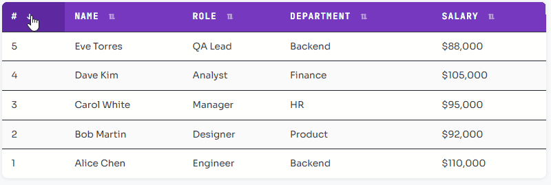
Adding Pagination to Bootstrap Table
Bootstrap table pagination slices the rows array into pages and renders only the current page’s rows. The pagination controls are plain Bootstrap .pagination nav buttons — no extra library needed for bootstrap table pagination using JavaScript.
class TablePaginator {
  constructor(tableId, pageSize = 5) {
    this.table      = document.getElementById(tableId);
    this.tbody      = this.table.querySelector('tbody');
    this.allRows    = [...this.tbody.querySelectorAll('tr')];
    this.pageSize   = pageSize;
    this.currentPage = 1;
  }

  get totalPages() {
    return Math.ceil(this.allRows.length / this.pageSize);
  }

  render() {
    const start = (this.currentPage - 1) * this.pageSize;
    const end   = start + this.pageSize;

    // Hide all, show only current page
    this.allRows.forEach((row, i) => {
      row.style.display = (i >= start && i < end) ? '' : 'none';
    });

    this.renderControls();
  }

  renderControls() {
    const nav = document.getElementById(`${this.table.id}-pagination`);
    if (!nav) return;

    nav.innerHTML = '';

    // Previous button
    const prev = createBtn('‹ Prev', () => {
      if (this.currentPage > 1) { this.currentPage--; this.render(); }
    }, this.currentPage === 1);
    nav.appendChild(prev);

    // Page number buttons
    for (let i = 1; i <= this.totalPages; i++) {
      const btn = createBtn(i, () => { this.currentPage = i; this.render(); });
      if (i === this.currentPage) btn.classList.add('active');
      nav.appendChild(btn);
    }

    // Next button
    const next = createBtn('Next ›', () => {
      if (this.currentPage < this.totalPages) { this.currentPage++; this.render(); }
    }, this.currentPage === this.totalPages);
    nav.appendChild(next);
  }
}

function createBtn(label, onClick, disabled = false) {
  const btn = document.createElement('button');
  btn.textContent = label;
  btn.disabled    = disabled;
  btn.addEventListener('click', onClick);
  return btn;
}

const paginator = new TablePaginator('myTable', 5);
paginator.render();
Bootstrap Table with Pagination Search and Sorting – Full Example
This is the complete responsive bootstrap table with pagination search sorting example — combining all three features into a single self-contained component. This is the bootstrap table pagination search sorting pattern you’ll use in production.
class BootstrapDataTable {
  constructor({ tableId, pageSize = 5, searchInputId, paginationId, infoId }) {
    this.table     = document.getElementById(tableId);
    this.tbody     = this.table.querySelector('tbody');
    this.allRows   = [...this.tbody.querySelectorAll('tr')];
    this.filtered  = [...this.allRows];
    this.pageSize  = pageSize;
    this.page      = 1;
    this.sortCol   = null;
    this.sortAsc   = true;

    if (searchInputId) this.bindSearch(searchInputId);
    this.bindSort();
    this.paginationEl = document.getElementById(paginationId);
    this.infoEl       = document.getElementById(infoId);
    this.render();
  }

  bindSearch(id) {
    document.getElementById(id).addEventListener('input', e => {
      const q = e.target.value.toLowerCase().trim();
      this.filtered = this.allRows.filter(row =>
        [...row.cells].some(c => c.textContent.toLowerCase().includes(q))
      );
      this.page = 1;   // reset to page 1 on new search
      this.render();
    });
  }

  bindSort() {
    this.table.querySelectorAll('thead th').forEach((th, i) => {
      th.style.cursor = 'pointer';
      th.addEventListener('click', () => {
        this.sortAsc   = this.sortCol === i ? !this.sortAsc : true;
        this.sortCol   = i;
        this.filtered.sort((a, b) => {
          const av = a.cells[i].textContent.trim();
          const bv = b.cells[i].textContent.trim();
          const an = parseFloat(av), bn = parseFloat(bv);
          if (!isNaN(an) && !isNaN(bn))
            return this.sortAsc ? an-bn : bn-an;
          return this.sortAsc ? av.localeCompare(bv) : bv.localeCompare(av);
        });
        this.page = 1;
        this.render();
      });
    });
  }

  render() {
    const start = (this.page - 1) * this.pageSize;
    const end   = start + this.pageSize;
    const total = this.filtered.length;

    // Rebuild tbody with filtered + paginated rows
    this.tbody.innerHTML = '';
    this.filtered.slice(start, end).forEach(row => this.tbody.appendChild(row));

    if (this.infoEl)
      this.infoEl.textContent =
        total === 0 ? 'No results found.'
        : `Showing ${start+1}–${Math.min(end,total)} of ${total} entries`;

    this.renderPagination(total);
  }

  renderPagination(total) {
    if (!this.paginationEl) return;
    const pages = Math.ceil(total / this.pageSize);
    this.paginationEl.innerHTML = '';

    const btn = (label, page, disabled, active) => {
      const b = document.createElement('button');
      b.textContent = label; b.disabled = disabled;
      if (active) b.classList.add('active');
      b.addEventListener('click', () => { this.page = page; this.render(); });
      return b;
    };

    this.paginationEl.appendChild(btn('‹', this.page-1, this.page===1));
    for (let i=1; i<=pages; i++)
      this.paginationEl.appendChild(btn(i, i, false, i===this.page));
    this.paginationEl.appendChild(btn('›', this.page+1, this.page===pages));
  }
}

// Initialize
new BootstrapDataTable({
  tableId:       'myTable',
  pageSize:      5,
  searchInputId: 'tableSearch',
  paginationId:  'tablePagination',
  infoId:        'tableInfo'
});
Using Bootstrap Table Plugin (bootstrap-table.js)
bootstrap-table.js is a dedicated plugin that adds bootstrap table pagination search sorting features through HTML data attributes with zero custom JavaScript. It’s ideal for rapid prototyping when you don’t need custom logic.
<!-- In <head> -->
<link rel="stylesheet"
      href="https://unpkg.com/bootstrap-table@1.22.1/dist/bootstrap-table.min.css">

<!-- In <body> before </body> -->
<script src="https://unpkg.com/bootstrap-table@1.22.1/dist/bootstrap-table.min.js"></script>

<!-- The table — all config via data-* attributes -->
<table
  data-toggle="table"
  data-search="true"
  data-pagination="true"
  data-page-size="5"
  data-sortable="true"
  class="table table-striped table-hover">

  <thead>
    <tr>
      <th data-field="id"         data-sortable="true">#</th>
      <th data-field="name"       data-sortable="true">Name</th>
      <th data-field="role"       data-sortable="true">Role</th>
      <th data-field="department" data-sortable="true">Department</th>
    </tr>
  </thead>
  <tbody>
    <tr><td>1</td><td>Alice Chen</td><td>Engineer</td><td>Backend</td></tr>
    <!-- more rows -->
  </tbody>
</table>Plugin Pros
+ Many built-in features (export, freeze columns, row detail)
+ Active community and documentation
+ Server-side pagination support
Plugin Cons
– Less control over custom behaviour
– Plugin version drift with Bootstrap
– Overkill for simple tables
Styling Bootstrap Table
Bootstrap 5 ships with contextual colour classes for both the table itself and individual rows or cells. Combine these with custom CSS for a polished bootstrap data table that matches your brand.
<!-- Table-level colour variants -->
<table class="table table-dark">          <!-- dark theme -->
<table class="table table-success">       <!-- green -->
<table class="table table-striped-columns"> <!-- column stripes -->

<!-- Row-level variants -->
<tr class="table-danger">   <!-- red row -->
<tr class="table-warning">  <!-- amber row -->
<tr class="table-primary">  <!-- blue highlight -->

<!-- Custom CSS overrides -->
<style>
  .table thead th {
    background: #6f42c1;
    color: #fff;
    border-bottom: 2px solid #5a32a3;
    white-space: nowrap;
    cursor: pointer;
    user-select: none;
  }
  .table thead th:hover {
    background: #5a32a3;
  }
  .table tbody tr:hover td {
    background-color: rgba(111, 66, 193, 0.06);
  }
  .table-responsive {
    border-radius: 8px;
    box-shadow: 0 2px 12px rgba(0,0,0,.08);
  }
</style>Table classes: table table-sm table-bordered table-borderless
table-striped table-striped-columns table-hover
table-dark table-light table-responsive{-sm/-md/-lg/-xl}
Color variants: table-primary table-secondary table-success
table-danger table-warning table-info
table-light table-dark
thead classes: thead-dark (use table-dark on thead instead in BS5)
table-group-divider (thick border above thead)Responsive Table on Mobile Devices
The table-responsive wrapper handles the most common mobile problem — horizontal overflow — but there are more advanced patterns for a truly great bootstrap responsive table mobile experience.
12-column financial table on a 375px screen
| Strategy | Implementation | All data visible | Effort |
|---|---|---|---|
| Horizontal scroll | .table-responsive | Yes (scroll) | Zero |
| Hide columns | .d-none .d-md-table-cell | Partial | Low |
| Card layout | CSS + media query transform | Yes (stacked) | High |
Hide low-priority columns on small screens
<table class="table">
  <thead>
    <tr>
      <th>Name</th>                           <!-- always visible -->
      <th>Status</th>                         <!-- always visible -->
      <th class="d-none d-sm-table-cell">Role</th>       <!-- 576px+ -->
      <th class="d-none d-md-table-cell">Department</th> <!-- 768px+ -->
      <th class="d-none d-lg-table-cell">Salary</th>     <!-- 992px+ -->
    </tr>
  </thead>
  <tbody>
    <tr>
      <td>Alice Chen</td>
      <td><span class="badge bg-success">Active</span></td>
      <td class="d-none d-sm-table-cell">Engineer</td>
      <td class="d-none d-md-table-cell">Backend</td>
      <td class="d-none d-lg-table-cell">$110,000</td>
    </tr>
  </tbody>
</table>Bootstrap 5 display utility classes for table cells
d-none d-sm-table-cell hides a cell below 576px. d-none d-md-table-cell hides below 768px. Apply the same classes to both <th> and <td> to keep columns aligned.Conclusion
| Use case | Recommended approach | Example in this guide |
|---|---|---|
| Simple bootstrap table example | Bootstrap classes only | Example 1 |
| Bootstrap 5 table responsive | .table-responsive wrapper | Example 2 |
| Bootstrap table search | Vanilla JS input filter | Example 3 |
| Bootstrap table sorting | Click handler + array sort | Example 4 |
| Bootstrap table pagination | TablePaginator class | Example 5 |
| Bootstrap table pagination search sorting | BootstrapDataTable class | Example 6 |
| Quick plugin-based bootstrap data table | bootstrap-table.js | Example 7 |
| Custom bootstrap responsive table mobile | Column hiding utilities | Example 8 |
Building a responsive Bootstrap table with pagination, search and sorting in Bootstrap 5 requires no external libraries — just Bootstrap’s CSS classes and ~150 lines of vanilla JavaScript. The BootstrapDataTable class from Example 6 is the foundation you can take directly into production: copy it, add your own data source (fetch from an API or populate from a server-rendered page), and extend with custom sort functions for date columns or badge columns.
If you need server-side bootstrap table pagination — where the server returns only one page of data at a time — wire the page and search state to API query parameters and replace the render() method with a fetch() call. The architecture is identical; only the data source changes. For very complex requirements (Excel export, frozen columns, tree rows), reach for bootstrap-table.js or DataTables — but for the vast majority of bootstrap table with search and sorting example needs, vanilla JS is more than enough.