
Learn everything you need to create a fully responsive Bootstrap 5 navbar — from a basic nav structure to hamburger menus, logo integration, dropdowns, search bars, and polished custom styling. No prior Bootstrap experience required.
⬇ Download the final Bootstrap 5 Navbar Source Code
Table of Contents
Navigation is the backbone of any website. Without a clear, accessible, and mobile-friendly navigation menu, visitors get lost — and lost visitors leave. The Bootstrap 5 navbar component solves this problem elegantly: it gives you a production-ready, fully responsive navigation bar with just a few classes and zero custom JavaScript.
In this tutorial, you’ll go from a bare HTML file to a beautiful, fully responsive website nav bar step by step. By the end, you’ll have built a navbar with a logo, dropdown menus, a search form, custom colors, and a hamburger toggle that works perfectly on every screen size. You’ll also leave with a reusable template you can drop into any project.
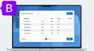
What you’ll build
🧭 What Is a Bootstrap 5 Navbar?
A Bootstrap 5 navbar is a pre-built, responsive navigation header component included in the Bootstrap CSS framework. It combines semantic HTML, utility classes, and optional JavaScript to produce a navigation bar that automatically adapts to any screen size.
Why Navigation Bars Matter for Modern Websites
Navigation menus do more than link pages together — they shape the entire user experience. Studies consistently show that users spend the first few seconds of a page visit scanning the navigation to orient themselves. A confusing or broken nav bar is one of the top reasons visitors bounce.
For mobile users — who now represent the majority of web traffic — a navbar responsive to small screens is not a luxury; it’s a requirement. Google’s mobile-first indexing also means your navigation structure directly affects SEO.
Mobile-First
Zero Custom JS
Accessible
aria-expanded, and keyboard navigation.Customizable
Features of the Bootstrap 5 Navbar Component
- Responsive collapsing at any breakpoint (
navbar-expand-sm/md/lg/xl/xxl) - Built-in brand / logo slot with
.navbar-brand - Dropdown menus with hover or click via Bootstrap’s Popper.js integration
- Sticky and fixed positioning utilities (
sticky-top,fixed-top) - Light and dark color schemes via
data-bs-theme - Native search form integration with
.d-flexutilities
Responsive Behavior Built into Bootstrap
The most powerful feature of the Bootstrap navbar is its built-in breakpoint system. You control the screen width at which the navbar expands from a collapsed (hamburger) state to a full horizontal menu using a single class. No media queries needed in your own CSS.
| Class | Expands at | Ideal for |
|---|---|---|
.navbar-expand-sm | ≥576px | Simple 2-3 link menus |
.navbar-expand-md | ≥768px | Tablet-first projects |
.navbar-expand-lg | ≥992px | Most websites (default choice) |
.navbar-expand-xl | ≥1200px | Large dashboards |
.navbar-expand-xxl | ≥1400px | Ultra-wide layouts |
⚙️ Setting Up Bootstrap 5 for Your Project
Before building your navbar, you need Bootstrap 5 in your project. You have two main options: the Bootstrap CDN (fastest to start) or npm (best for production builds).
Using Bootstrap CDN
The CDN method requires no installation. Add the Bootstrap CSS link in your
<head> and the Bundle JS (which includes Popper) before </body>:
Starter Template: COPY & USE
<!DOCTYPE html>
<html lang="en">
<head>
  <meta charset="UTF-8">
  <meta name="viewport" content="width=device-width, initial-scale=1.0">
  <title>My Bootstrap 5 Website</title>

  <!-- Bootstrap 5 CSS -->
  <link
    href="https://cdn.jsdelivr.net/npm/bootstrap@5.3.3/dist/css/bootstrap.min.css"
    rel="stylesheet"
    integrity="sha384-QWTKZyjpPEjISv5WaRU9OFeRpok6YctnYmDr5pNlyT2bRjXh0JMhjY6hW+ALEwIH"
    crossorigin="anonymous"
  >
</head>
<body>

  <!-- Your navbar and content here -->

  <!-- Bootstrap 5 Bundle JS (includes Popper) -->
  <script
    src="https://cdn.jsdelivr.net/npm/bootstrap@5.3.3/dist/js/bootstrap.bundle.min.js"
    integrity="sha384-YvpcrYf0tY3lHB60NNkmXc4s9bIOgUxi8T/jzmQZn2ug6LzNVN/GCKmraBkjpqGv"
    crossorigin="anonymous"
  ></script>
</body>
</html>Always use the Bundle JS
bootstrap.bundle.min.js — it includes Popper. Using
bootstrap.min.js alone will break your navbar toggle.Installing Bootstrap with npm
For production projects using a bundler like Vite, Webpack, or Parcel:
# Install Bootstrap 5 via npm
npm install bootstrap@5.3.3

# Then import in your main JS entry file:
# import 'bootstrap/dist/css/bootstrap.min.css';
# import 'bootstrap/dist/js/bootstrap.bundle.min.js';Basic Project Structure
my-project/
├── index.html        ← Main HTML file
├── css/
│   └── custom.css    ← Your overrides (loaded AFTER Bootstrap)
├── js/
│   └── main.js       ← Optional custom JS
└── img/
└── logo.svg ← Brand logoLoad your CSS after Bootstrap
custom.css file must be linked after the Bootstrap CSS link so your styles override Bootstrap’s defaults without needing !important.🔨 Creating Your First Bootstrap Menu Navbar
Basic Navbar Structure
Every Bootstrap navbar starts with a <nav> element and a handful of semantic
classes. Here is the simplest possible example:
<nav class="navbar navbar-expand-lg bg-body-tertiary">
  <div class="container">

    <!-- Brand / Logo -->
    <a class="navbar-brand" href="#">MyBrand</a>

    <!-- Mobile Hamburger Toggle -->
    <button
      class="navbar-toggler"
      type="button"
      data-bs-toggle="collapse"
      data-bs-target="#navbarNav"
      aria-controls="navbarNav"
      aria-expanded="false"
      aria-label="Toggle navigation"
    >
      <span class="navbar-toggler-icon"></span>
    </button>

    <!-- Collapsible Nav Links -->
    <div class="collapse navbar-collapse" id="navbarNav">
      <ul class="navbar-nav ms-auto">
        <li class="nav-item">
          <a class="nav-link active" href="#">Home</a>
        </li>
        <li class="nav-item">
          <a class="nav-link" href="#">About</a>
        </li>
        <li class="nav-item">
          <a class="nav-link" href="#">Services</a>
        </li>
        <li class="nav-item">
          <a class="nav-link" href="#">Contact</a>
        </li>
      </ul>
    </div>

  </div>
</nav>Understanding Navbar Classes
Each class in the navbar plays a specific, important role:
| Class | Purpose | Required? |
|---|---|---|
.navbar | Base component class. Sets flex display, padding, and z-index. | ✅ Yes |
.navbar-expand-lg | Controls the breakpoint at which the navbar expands to horizontal. | ✅ Yes |
.container | Constrains content width and centers the navbar horizontally. | Recommended |
.navbar-brand | Styles the logo / brand name link with proper sizing and spacing. | Optional |
.navbar-nav | Wraps the <ul> of nav items with flex layout. | ✅ Yes |
.nav-link | Styles individual links with padding, hover states, and active indicator. | ✅ Yes |
.ms-auto | Pushes the nav links to the right using margin-start: auto. | Optional |
Adding Navigation Links
Navigation links follow a strict three-level hierarchy: <ul class="navbar-nav">
wraps <li class="nav-item"> elements, each of which contains an
<a class="nav-link">. This structure is required for Bootstrap’s spacing,
active states, and accessibility attributes to work correctly.
The .active class
class="nav-link active" and aria-current="page" to the link matching the current page. Bootstrap will highlight it visually and screen readers will announce it as the current page.📱 Making the Navbar Responsive
Understanding Breakpoints
Bootstrap uses a mobile-first approach. By default, the navbar is collapsed (hamburger mode)
and only expands to a horizontal menu once the screen is wide enough. The breakpoint
is controlled entirely by the .navbar-expand-{breakpoint} class.
Choosing the Right Breakpoint
Your marketing website has 5 nav links. On a tablet (768px), the horizontal nav looks cramped. On desktop (992px+), it’s perfect.
✅ Use .navbar-expand-lg — the menu collapses on mobile and tablet,
and expands on desktops (992px+). This is the right choice for most business and
portfolio websites.
Adding the Mobile Hamburger Menu
The hamburger button is already included in the basic structure above. The critical part is the data attribute bridge between the button and the collapsible div:
<!-- The button: data-bs-target must match the collapse div's id -->
<button
  class="navbar-toggler"
  type="button"
  data-bs-toggle="collapse"
  data-bs-target="#navbarMain"       <!-- Must match id below -->
  aria-controls="navbarMain"
  aria-expanded="false"
  aria-label="Toggle navigation"
>
  <span class="navbar-toggler-icon"></span>
</button>

<!-- The collapsible region: id must match data-bs-target -->
<div class="collapse navbar-collapse" id="navbarMain">
  <!-- nav links here -->
</div>Using the Collapse Component
The bootstrap collapse navbar menu behavior is driven by
Bootstrap’s Collapse JavaScript plugin, which reads the data-bs-toggle="collapse"
and data-bs-target attributes. When the button is clicked, Bootstrap toggles
the .show class on the target element and animates its height.
How the Navbar Behaves on Different Screen Sizes
| Screen Width | With .navbar-expand-lg | User Experience |
|---|---|---|
| 0 – 991px | Hamburger icon shown, links hidden | Tap ☰ to open a vertical dropdown |
| 992px+ | All links visible horizontally | Standard desktop navigation bar |
Result: EXPECTED OUTPUT
– On desktop: a horizontal nav bar with all links visible.
– On mobile: a single hamburger icon; tapping it reveals links stacked vertically with a smooth slide-down animation.
– The button has proper ARIA attributes for screen reader compatibility.
🏷️ Adding a Logo to the Navbar bootstrap, navbar with logo
Text Logo Example
The simplest logo is a styled text brand. Use .navbar-brand on an anchor tag —
Bootstrap handles the font size, padding, and alignment automatically:
<a class="navbar-brand fw-bold" href="/">
  <span style="color: #5b6fff;">My</span>Brand
</a>Image Logo Example
For a proper bootstrap header navbar with logo, place an <img>
tag inside .navbar-brand. Use Bootstrap’s sizing utilities and always include
explicit dimensions to prevent layout shifts:
<a class="navbar-brand" href="/">
  <img
    src="img/logo.svg"
    alt="MyBrand Logo"
    width="140"
    height="36"
    class="d-inline-block align-text-top"
  >
</a>

<!-- Logo + Text combo -->
<a class="navbar-brand d-flex align-items-center gap-2" href="/">
  <img src="img/logo.svg" alt="Logo" width="32" height="32">
  <span class="fw-bold">MyBrand</span>
</a>Responsive Branding Tips
- Use SVG logos — they scale perfectly at all resolutions, including retina displays.
- Avoid logos wider than 180px to keep space for nav links on mid-range screens.
- Always set
widthandheightattributes on images to prevent cumulative layout shift (CLS) — a Core Web Vital. - Use
class="d-inline-block align-text-top"ord-flex align-items-centerfor precise vertical alignment with text.
🔽 Creating a Bootstrap Dropdown Navbar
Basic Dropdown Menu
A bootstrap dropdown navbar lets you nest sub-pages under a parent link.
The structure requires adding the .dropdown class to the <li>,
converting the link to a .dropdown-toggle, and adding a sibling
.dropdown-menu div:
<li class="nav-item dropdown">

  <!-- Dropdown Toggle Button -->
  <a
    class="nav-link dropdown-toggle"
    href="#"
    role="button"
    data-bs-toggle="dropdown"
    aria-expanded="false"
  >
    Services
  </a>

  <!-- Dropdown Menu -->
  <ul class="dropdown-menu">
    <li><a class="dropdown-item" href="#">Web Design</a></li>
    <li><a class="dropdown-item" href="#">Development</a></li>
    <li><hr class="dropdown-divider"></li>
    <li><a class="dropdown-item" href="#">Consulting</a></li>
  </ul>

</li>Adding Multiple Dropdown Items
You can have multiple dropdowns in the same navbar — just repeat the pattern for each
.nav-item.dropdown. Use .dropdown-divider to visually group
related items within a single dropdown.
Mobile-Friendly Dropdown Navigation
Bootstrap dropdowns work on mobile without any extra code. When the navbar is collapsed and the user opens the hamburger menu, dropdowns become accordion-style — clicking the toggle expands the sub-items inline, keeping everything within the collapsed menu. No separate mobile logic required.
Limit dropdown depth
🔍 Adding a Search Box to the Navigation Bar: bootstrap nav search
Bootstrap Search Form Example
Bootstrap 5 makes it easy to add a bootstrap nav search form by placing
a <form> with class="d-flex" inside the collapsible div,
alongside your nav links:
<div class="collapse navbar-collapse" id="navbarSearch">

  <!-- Nav Links -->
  <ul class="navbar-nav me-auto mb-2 mb-lg-0">
    <li class="nav-item"><a class="nav-link" href="#">Home</a></li>
    <li class="nav-item"><a class="nav-link" href="#">Blog</a></li>
  </ul>

  <!-- Search Form (right-aligned via ms-auto or me-auto on ul above) -->
  <form class="d-flex" role="search">
    <input
      class="form-control me-2"
      type="search"
      placeholder="Search..."
      aria-label="Search"
    >
    <button class="btn btn-outline-primary" type="submit">
      Search
    </button>
  </form>

</div>Search Icon Integration
Replace the “Search” button text with an SVG icon for a cleaner look. Bootstrap Icons provides a free icon set you can load via CDN:
<!-- Add Bootstrap Icons CDN in <head> -->
<link rel="stylesheet"
  href="https://cdn.jsdelivr.net/npm/bootstrap-icons@1.11.3/font/bootstrap-icons.min.css">

<!-- Search button with icon -->
<button class="btn btn-outline-primary" type="submit" aria-label="Search">
  <i class="bi bi-search"></i>
</button>Responsive Search Layout
On mobile, the search form will stack below the nav links inside the open hamburger menu.
Add w-100 to the input on small screens using Bootstrap’s responsive utilities
if you want it to fill the full width when collapsed.
🎨 Customizing the Navbar Design: beautiful navbar bootstrap
Changing Colors
Bootstrap 5 uses CSS custom properties, making color customization straightforward. You can use the built-in theme classes or override the variables entirely:
<!-- Built-in dark theme -->
<nav class="navbar navbar-expand-lg" data-bs-theme="dark" style="background-color: #1a1d2a;">

<!-- OR override with custom CSS -->
<style>
  .navbar-custom {
    background: linear-gradient(135deg, #1a1d2a, #0c0e14);
    border-bottom: 1px solid rgba(255,255,255,0.08);
    padding: 0;
  }
  .navbar-custom .nav-link {
    color: rgba(255,255,255,0.75);
    padding: 1.2rem 1rem;
    transition: color 0.2s;
  }
  .navbar-custom .nav-link:hover,
  .navbar-custom .nav-link.active {
    color: #5b6fff;
  }
</style>Adjusting Navbar Height and Spacing
/* Make the navbar taller */
.navbar {
  min-height: 72px;
  padding-top: 0;
  padding-bottom: 0;
}

/* Increase link spacing */
.navbar .nav-link {
  padding-left: 1.25rem;
  padding-right: 1.25rem;
}

/* Larger brand text */
.navbar-brand {
  font-size: 1.4rem;
  font-weight: 800;
  letter-spacing: -0.03em;
}Adding Hover Effects
/* Animated underline on hover */
.nav-link {
  position: relative;
  overflow: hidden;
}
.nav-link::after {
  content: '';
  position: absolute;
  bottom: 0; left: 50%;
  transform: translateX(-50%) scaleX(0);
  width: 80%; height: 2px;
  background: #5b6fff;
  border-radius: 99px;
  transition: transform 0.25s ease;
}
.nav-link:hover::after,
.nav-link.active::after {
  transform: translateX(-50%) scaleX(1);
}Creating a Beautiful Bootstrap Navbar
The most visually striking Bootstrap navbars combine three things:
(1) a distinct background — dark gradient, frosted glass, or a branded solid color;
(2) an animated hover effect on links — underline slide, color pop, or background pill;
(3) a standout CTA button in the nav — using .btn.btn-primary with
your brand color for a “Get Started” or “Sign Up” link. Together, these three layers create a
nav that feels designed rather than default.
🌐 Bootstrap 5 Responsive Navbar Examples
Business Website Navbar
A business navbar typically has: logo left, 4–6 links center or right, and a “Contact Us”
or “Get a Quote” CTA button. Use .btn.btn-primary.ms-2 as the final nav item:
<ul class="navbar-nav ms-auto align-items-center gap-1">
  <li class="nav-item"><a class="nav-link" href="#">Solutions</a></li>
  <li class="nav-item"><a class="nav-link" href="#">Pricing</a></li>
  <li class="nav-item"><a class="nav-link" href="#">About</a></li>
  <li class="nav-item ms-2">
    <a class="btn btn-primary px-4" href="#">Get a Quote</a>
  </li>
</ul>Portfolio Website Navbar
A portfolio nav is typically minimal — brand name, anchor links to sections, and an
“Email Me” or “Hire Me” button. Use smooth-scroll anchors with href="#section-id"
and add scroll-behavior: smooth to your CSS html selector.
SaaS Application Navbar
SaaS navbars commonly split into two groups: marketing links (Features, Pricing, Docs) on
the left, and auth links (Log In, Sign Up) on the right. Use two separate
.navbar-nav elements with me-auto and ms-auto:
<div class="collapse navbar-collapse" id="navbarSaaS">
  <!-- Left group -->
  <ul class="navbar-nav me-auto">
    <li class="nav-item"><a class="nav-link" href="#">Features</a></li>
    <li class="nav-item"><a class="nav-link" href="#">Pricing</a></li>
    <li class="nav-item"><a class="nav-link" href="#">Docs</a></li>
  </ul>

  <!-- Right group (auth) -->
  <ul class="navbar-nav align-items-center gap-2">
    <li class="nav-item"><a class="nav-link" href="#">Log In</a></li>
    <li class="nav-item">
      <a class="btn btn-primary" href="#">Start Free Trial</a>
    </li>
  </ul>
</div>E-commerce Navbar
E-commerce navbars need category dropdowns, a search bar, and cart/account icons on the right.
Use Bootstrap Icons for the cart and user icons. Add .badge inside the cart icon
to show the item count dynamically with JavaScript.
🚨 Common Bootstrap Navbar Mistakes and How to Fix Them
Navbar Toggle Not Working
This is the most common beginner issue. It almost always comes down to one of three causes:
WRONG
FIXED
WRONG
FIXED
Dropdown Menu Issues
Dropdown not opening?
data-bs-toggle="dropdown" is on the toggle element AND that
Bootstrap’s Bundle JS is loaded. Dropdowns require Popper.js (included in the bundle).
Also verify you haven’t accidentally added type="submit" to a dropdown
toggle inside a form.Mobile Layout Problems
WRONG
FIXED
Alignment and Spacing Errors
| Problem | Likely Cause | Fix |
|---|---|---|
| Links not right-aligned | Missing .ms-auto on .navbar-nav | Add class="navbar-nav ms-auto" |
| Brand and links not on same line | Missing .navbar-expand-{bp} | Add class="navbar navbar-expand-lg" |
| Nav overflows on tablets | Too many links, wrong breakpoint | Switch from -lg to -xl or reduce links |
| Hamburger icon invisible | Icon color conflicts with background | Add data-bs-theme="dark" or data-bs-theme="light" |
📋 Bootstrap Navbar Template You Can Reuse: bootstrap navbar template
Complete Responsive Navbar Example
This is the complete, production-ready bootstrap navbar template combining everything covered in this tutorial: logo, nav links, dropdown, search, and a CTA button. Copy, paste, and customize it for your next project.
<nav class="navbar navbar-expand-lg" data-bs-theme="dark" style="background:#1a1d2a;border-bottom:1px solid rgba(255,255,255,0.08)">
  <div class="container">

    <!-- ① Brand / Logo -->
    <a class="navbar-brand d-flex align-items-center gap-2" href="/">
      <img src="img/logo.svg" alt="Logo" width="32" height="32">
      <span class="fw-bold">MyBrand</span>
    </a>

    <!-- ② Mobile Hamburger -->
    <button
      class="navbar-toggler"
      type="button"
      data-bs-toggle="collapse"
      data-bs-target="#navbarMain"
      aria-controls="navbarMain"
      aria-expanded="false"
      aria-label="Toggle navigation"
    >
      <span class="navbar-toggler-icon"></span>
    </button>

    <!-- ③ Collapsible Content -->
    <div class="collapse navbar-collapse" id="navbarMain">

      <!-- Nav Links -->
      <ul class="navbar-nav me-auto mb-2 mb-lg-0">
        <li class="nav-item">
          <a class="nav-link active" aria-current="page" href="/">Home</a>
        </li>

        <!-- Dropdown -->
        <li class="nav-item dropdown">
          <a
            class="nav-link dropdown-toggle"
            href="#"
            role="button"
            data-bs-toggle="dropdown"
            aria-expanded="false"
          >Services</a>
          <ul class="dropdown-menu dropdown-menu-dark">
            <li><a class="dropdown-item" href="#">Web Design</a></li>
            <li><a class="dropdown-item" href="#">Development</a></li>
            <li><hr class="dropdown-divider"></li>
            <li><a class="dropdown-item" href="#">Consulting</a></li>
          </ul>
        </li>

        <li class="nav-item"><a class="nav-link" href="#">Blog</a></li>
        <li class="nav-item"><a class="nav-link" href="#">Pricing</a></li>
      </ul>

      <!-- Search + CTA -->
      <div class="d-flex align-items-center gap-2">
        <form class="d-flex" role="search">
          <input
            class="form-control form-control-sm me-2"
            type="search"
            placeholder="Search..."
            aria-label="Search"
          >
          <button class="btn btn-outline-light btn-sm" type="submit">
            Search
          </button>
        </form>
        <a class="btn btn-primary btn-sm px-3" href="#">Get Started</a>
      </div>

    </div>
  </div>
</nav>Code Breakdown
-
Brand/Logo —
.navbar-brandwith a flex wrapper for icon + text logo combo. Replace the<img>src with your real logo file. -
Hamburger Button — the
data-bs-targetID must exactly match theidon the collapsible<div>below it. -
Nav Links + Dropdown —
me-autopushes this group left, leaving space for the search and CTA on the right. -
Search + CTA — wrapped in a
.d-flexdiv so they stay inline and grouped together on all screen sizes.
Customization Ideas
- Replace
data-bs-theme="dark"withdata-bs-theme="light"and change the background to white for a light navbar. - Add
class="sticky-top"to the<nav>to make it stick on scroll. - Add a backdrop blur effect:
backdrop-filter: blur(12px); background: rgba(26,29,42,0.85); - Replace the text search button with a Bootstrap Icon (
<i class="bi bi-search">) for a sleeker look.
✅ Best Practices for Website Navigation Bars
Keep Menus Simple
Research by the Nielsen Norman Group consistently shows that users prefer simpler navigation. Limit your top-level nav to 5–7 items maximum. If you have more, use a mega-menu or restructure your information architecture rather than cramming more items into the primary nav.
The 7-item rule
Optimize for Mobile Users
- Ensure touch targets (links and buttons) are at least 44×44px — Apple and Google’s minimum recommendation.
- Test your hamburger menu on a real device, not just browser devtools.
- Avoid hover-only interactions — mobile has no hover state.
- Keep the collapsed nav items to a single scroll — users shouldn’t need to scroll inside an open hamburger menu.
Use Clear Labels
Navigation labels should describe the destination, not be clever. “Solutions” tells users less than “Services”. “Learn” tells them less than “Blog” or “Tutorials”. When in doubt, choose the clearest, most specific word over the most impressive-sounding one.
Improve Accessibility
- Always include
aria-label="Toggle navigation"on the hamburger button. - Add
aria-current="page"to the active nav link. - Ensure dropdowns are keyboard-navigable — Bootstrap’s JS handles this automatically when using the correct markup.
- Test color contrast ratios: nav link text should have a minimum 4.5:1 contrast ratio against the navbar background (WCAG AA).
- Use semantic
<nav>element and a descriptivearia-label="Main navigation"attribute.
Full ARIA nav pattern
aria-label="Main navigation" to your
<nav> element. If the page has multiple <nav>
regions, give each a unique label so screen reader users can navigate between them.🎉 You’ve Built a Complete Bootstrap 5 Navbar
You now know everything you need to create a production-ready, responsive Bootstrap 5 navbar. You’ve learned the core component structure, how the collapse and dropdown systems work, how to add a logo and search bar, how to customize colors and hover effects, and how to avoid the most common mistakes developers run into.
The complete template at the end of this guide is yours to take. Swap in your brand colors, replace the logo, adjust the links — and you’ll have a beautiful, fully responsive website nav bar ready to ship.
Next step: open the starter template, paste in the complete navbar code, and start customizing. The best way to learn Bootstrap is to break things and fix them.
Written with ❤️ for Bootstrap developers