Learn how to create a Bootstrap 5 responsive mega menu on hover with real examples. Discover dropdown mega menus, tabbed layouts, vertical menus, and submenu hover techniques using HTML, CSS, and Bootstrap 5.
If you prefer a video tutorial to quickly understand how to build and customize your own bootstrap mega menu template see the YouTube video here:
Table of Contents
Introduction to Bootstrap 5 Responsive Mega Menu
A bootstrap responsive mega menu is a wide, multi-column navigation panel that appears when a user hovers or clicks a top-level nav item. Unlike a standard single-column dropdown, it uses the full or near-full viewport width to organise dozens of links, images, calls-to-action, and icons into a scannable grid.
Bootstrap 5 dropped jQuery and modernised its JavaScript API, which makes building a bootstrap 5 mega menu example more lightweight than ever. Every pattern in this guide runs on Bootstrap 5’s native Dropdown, Tab, and Collapse components — no third-party plugins required.
Zero jQuery
CSS Grid friendly
Mobile-first
lg breakpoint.ARIA-ready
aria-expanded and aria-haspopup automatically.Before you start
bootstrap.bundle.min.js (includes Popper.js) for dropdown positioning, plus a custom stylesheet for your mega menu overrides.Bootstrap 5 Mega Menu vs Standard Dropdown
Deciding between a standard bootstrap dropdown mega menu and a plain Bootstrap dropdown comes down to navigation depth and content richness. Here’s a clear side-by-side:
| Feature | Standard Dropdown | Mega Menu |
|---|---|---|
| Width | Trigger-width (~200 px) | Full / near-full viewport |
| Columns | Single column | 2 – 6+ columns |
| Content types | Links only | Links, images, text, CTAs, icons |
| Best for | Shallow nav (< 8 items) | Large catalogues, rich navigation |
| Hover support | Manual CSS needed | Built into examples below |
| Bootstrap support | Native (.dropdown) | Custom extension of .dropdown |
| Accessibility effort | Low | Medium (extra ARIA tuning) |
| Mobile behaviour | Collapses naturally | Requires explicit stacking logic |
Use a Mega Menu when…
✓ Each category contains 6+ sub-links
✓ You want to embed images or CTAs
✓ Users scan horizontally (UX research)
✓ Brand visibility in the nav matters
Stick to a plain Dropdown when…
✗ Traffic is predominantly mobile
✗ Content doesn’t warrant wide panels
✗Team has no custom CSS capacity
Example 1 – Basic Bootstrap Dropdown Mega Menu
The simplest bootstrap dropdown mega menu overrides Bootstrap’s native .dropdown-menu width and wraps content in a Bootstrap .row. No extra libraries, no build step.
Scenario
See how it will look and code below.

<!-- Bootstrap 5 CDN — paste inside <head> -->
<link href="https://cdn.jsdelivr.net/npm/bootstrap@5.3.2/dist/css/bootstrap.min.css"
      rel="stylesheet">

<nav class="navbar navbar-expand-lg bg-white shadow-sm">
  <div class="container" style="position:relative">
    <a class="navbar-brand fw-bold" href="#">ShopCo</a>

    <ul class="navbar-nav">
      <li class="nav-item dropdown mega-item">
        <a class="nav-link dropdown-toggle"
           href="#"
           data-bs-toggle="dropdown"
           aria-expanded="false">
          Products
        </a>

        <div class="dropdown-menu mega-panel p-4">
          <div class="row g-4">

            <div class="col-6">
              <p class="mega-col-title">Computers</p>
              <a class="mega-link" href="#">Laptops</a>
              <a class="mega-link" href="#">Desktops</a>
              <a class="mega-link" href="#">Monitors</a>
            </div>

            <div class="col-6">
              <p class="mega-col-title">Mobile</p>
              <a class="mega-link" href="#">Smartphones</a>
              <a class="mega-link" href="#">Tablets</a>
              <a class="mega-link" href="#">Wearables</a>
            </div>

          </div>
        </div>
      </li>
    </ul>
  </div>
</nav>/* Anchor dropdown relative to navbar container */
.navbar { position: relative; }
.mega-item { position: static; } /* override Bootstrap's relative */
.mega-panel {
position: absolute;
left: 0; right: 0; /* full-width */
margin-top: 0;
border-top: 3px solid #0d6efd;
border-radius: 0 0 12px 12px;
box-shadow: 0 12px 40px rgba(0,0,0,.12);
}
.mega-col-title {
font-size: .68rem; font-weight: 700;
text-transform: uppercase; letter-spacing: .1em;
color: #9ca3af; margin-bottom: .6rem;
padding-bottom: .4rem; border-bottom: 1px solid #f3f4f6;
}
.mega-link {
display: flex; align-items: center; gap: 8px;
padding: .35rem .6rem; border-radius: 6px;
font-size: .875rem; color: #374151;
text-decoration: none;
transition: background .12s, color .12s, padding-left .12s;
}
.mega-link:hover {
background: #eff6ff; color: #1d4ed8;
padding-left: .9rem; /* subtle indent */
}Full-width positioning trick
position: static on the .mega-item <li> to override Bootstrap’s default position: relative, then set left:0; right:0 on .dropdown-menu. This anchors the panel to the container, not the nav item.Example 2 – Bootstrap Mega Menu with Submenu on Hover
Bootstrap 5’s dropdown fires on click by default. To create a true bootstrap mega menu with submenu on hover, you intercept mouseenter/mouseleave events with a tiny JavaScript snippet and let CSS handle the animation. Mobile users still get the click-toggle fallback.
Scenario

/* Activate on hover — desktop only */
@media (min-width: 992px) {
  .mega-item:hover .dropdown-menu {
    display: block;
    margin-top: 0;
    animation: megaFadeIn .2s ease;
  }
  .mega-item .dropdown-toggle::after {
    transition: transform .2s;
  }
  .mega-item:hover .dropdown-toggle::after {
    transform: rotate(180deg);
  }
}

@keyframes megaFadeIn {
  from { opacity: 0; transform: translateY(-8px); }
  to   { opacity: 1; transform: translateY(0); }
}

/* Close gap between trigger and panel (prevents flicker) */
.mega-item .dropdown-menu {
  margin-top: 0 !important;
}// Enhance hover — handles Bootstrap's aria-expanded state too
document.querySelectorAll('.mega-item').forEach(el => {
const toggle = el.querySelector('.dropdown-toggle');
const menu = el.querySelector('.dropdown-menu');
const inst = bootstrap.Dropdown.getOrCreateInstance(toggle);
el.addEventListener('mouseenter', () => {
if (window.innerWidth >= 992) {
inst.show();
}
});
el.addEventListener('mouseleave', () => {
if (window.innerWidth >= 992) {
inst.hide();
}
});
// Prevent the panel from closing when mouse moves into it
menu?.addEventListener('mouseenter', () => {
if (window.innerWidth >= 992) menu.classList.add('show');
});
menu?.addEventListener('mouseleave', () => {
if (window.innerWidth >= 992) inst.hide();
});
});WCAG 1.4.13 — Hover content
Escape handler covers this automatically.Example 3 – Creating a Responsive Mega Menu (Mobile Friendly)
A responsive mega menu bootstrap 5 implementation must collapse gracefully to a stacked list on small screens. The technique: columns fill full-width on sm using col-lg-X col-12, and the panel resets to position:static inside the Bootstrap collapse container.
Scenario
<div class="dropdown-menu mega-panel p-4">
  <div class="row g-3">

    <!-- col-lg-3: 4 columns on desktop, col-12: stacked on mobile -->
    <div class="col-lg-3 col-12">
      <p class="mega-col-title">News</p>
      <a class="mega-link" href="#">World</a>
      <a class="mega-link" href="#">Business</a>
      <a class="mega-link" href="#">Technology</a>
    </div>

    <div class="col-lg-3 col-12">
      <p class="mega-col-title">Video</p>
      <a class="mega-link" href="#">Documentaries</a>
      <a class="mega-link" href="#">Live Events</a>
    </div>

    <!-- repeat for col 3 and col 4 ... -->

  </div>
</div>/* Desktop: full-width absolute panel */
@media (min-width: 992px) {
.mega-panel {
position: absolute;
left: 0; right: 0;
}
}
/* Mobile: remove absolute, let it stack inside collapse */
@media (max-width: 991.98px) {
.mega-panel {
position: static !important;
width: 100%;
min-width: unset;
border-top: none;
box-shadow: none;
border-radius: 0;
padding: .75rem 0;
}
.mega-panel .col-lg-3 {
border-bottom: 1px solid #f3f4f6;
padding-bottom: .75rem;
margin-bottom: .5rem;
}
}Always include aria-label on the toggler
aria-label="Toggle navigation" and aria-expanded="false" — Bootstrap 5 updates aria-expanded automatically on show/hide, so you only need to set the initial state.Vertical Mega Menu in Bootstrap 5
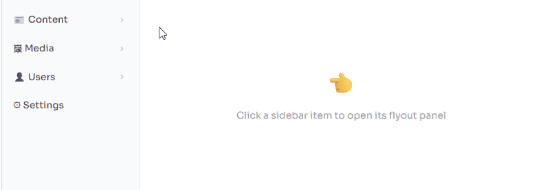
For admin dashboards and sidebar-driven layouts, a vertical bootstrap navbar mega menu runs down the left side and reveals a flyout panel to the right when a category is clicked or hovered. Bootstrap’s .dropend direction class handles the positioning automatically.
Scenario
<nav class="d-flex">

  <!-- Sidebar -->
  <ul class="nav flex-column sidebar-nav">

    <!-- Use .dropend for right-side flyout -->
    <li class="nav-item dropend mega-vert">
      <a class="nav-link dropdown-toggle"
         href="#"
         data-bs-toggle="dropdown"
         aria-expanded="false">
        📰 Content
      </a>

      <div class="dropdown-menu flyout-panel p-3">
        <div class="row g-3">
          <div class="col-6">
            <p class="mega-col-title">Publishing</p>
            <a class="mega-link" href="#">Posts</a>
            <a class="mega-link" href="#">Pages</a>
          </div>
          <div class="col-6">
            <p class="mega-col-title">Organisation</p>
            <a class="mega-link" href="#">Tags</a>
            <a class="mega-link" href="#">Categories</a>
          </div>
        </div>
      </div>

    </li>
  </ul>
</nav>.sidebar-nav {
width: 200px;
background: #f8fafc;
border-right: 1px solid #e2e8f0;
min-height: 100vh;
padding: 1rem 0;
}
.flyout-panel {
min-width: 340px;
border: none;
border-left: 3px solid #0d6efd;
box-shadow: 4px 0 24px rgba(0,0,0,.12);
border-radius: 0 10px 10px 0;
}Bootstrap .dropend and .dropstart
.dropend (right flyout) and .dropstart (left flyout) as sibling classes to .dropdown. They automatically reposition the .dropdown-menu without any custom CSS for the direction.Tabbed Mega Menu in Bootstrap 5
The tabbed pattern is the most content-rich bootstrap 5 mega menu example available. Left-side vertical pill tabs act as the category switcher; the right side renders the corresponding link grid for the active tab. Bootstrap’s native nav-pills + tab-content handles state automatically.
Scenario

<div class="dropdown-menu mega-panel p-0" style="min-width:640px">
  <div class="row g-0">

    <!-- Left column: vertical pill tabs (category switcher) -->
    <div class="col-auto bg-light border-end" style="min-width:160px">
      <div class="nav flex-column nav-pills p-2"
           id="mega-tabs"
           role="tablist"
           aria-orientation="vertical">

        <button class="nav-link active text-start"
                id="tab-fe-btn"
                data-bs-toggle="pill"
                data-bs-target="#panel-fe"
                type="button"
                role="tab"
                aria-controls="panel-fe"
                aria-selected="true">
          🎨 Frontend
        </button>

        <button class="nav-link text-start"
                id="tab-be-btn"
                data-bs-toggle="pill"
                data-bs-target="#panel-be"
                type="button" role="tab"
                aria-controls="panel-be"
                aria-selected="false">
          ⚙️ Backend
        </button>

        <!-- repeat for DevOps, Security ... -->
      </div>
    </div>

    <!-- Right column: content panels -->
    <div class="col p-3">
      <div class="tab-content" id="mega-tab-content">

        <div class="tab-pane fade show active"
             id="panel-fe"
             role="tabpanel"
             aria-labelledby="tab-fe-btn">
          <p class="mega-col-title">Frontend Tooling</p>
          <div class="row g-1">
            <div class="col-6">
              <a class="mega-link" href="#">⚡ Vite</a>
              <a class="mega-link" href="#">🔵 TypeScript</a>
            </div>
            <div class="col-6">
              <a class="mega-link" href="#">🌀 Tailwind</a>
              <a class="mega-link" href="#">📦 ESBuild</a>
            </div>
          </div>
        </div>

        <!-- Repeat .tab-pane for #panel-be, #panel-do, #panel-sec -->

      </div>
    </div>

  </div>
</div>Example 6 – Mega Menu with Featured Image Column
Combining a mega menu html css layout with a promotional image block creates the kind of rich navigation experience you see on major e-commerce and SaaS brands. A three-column layout uses the third column for a styled promo card.
Scenario

<div class="dropdown-menu mega-panel p-3">
  <div class="row g-4 align-items-start">

    <!-- Column 1: links -->
    <div class="col-4">
      <p class="mega-col-title">Women</p>
      <a class="mega-link" href="#">Dresses</a>
      <a class="mega-link" href="#">Tops & Blouses</a>
    </div>

    <!-- Column 2: links -->
    <div class="col-4">
      <p class="mega-col-title">Men</p>
      <a class="mega-link" href="#">Shirts</a>
      <a class="mega-link" href="#">Jackets</a>
    </div>

    <!-- Column 3: promotional image + CTA -->
    <div class="col-4">
      <div class="promo-card rounded-3 overflow-hidden">
        <img
          src="summer-sale.jpg"
          alt="Summer Sale – 30% off selected styles"
          class="img-fluid w-100"
          style="max-height:130px;object-fit:cover"
          loading="lazy">
        <div class="promo-body p-2 text-center">
          <span class="badge bg-warning text-dark mb-1">New Season</span>
          <p class="fw-bold small mb-1">Summer '25</p>
          <a href="#" class="btn btn-sm btn-primary w-100">
            Shop the Edit →
          </a>
        </div>
      </div>
    </div>

  </div>
</div>Image alt text inside navigation
alt describe the destination, not the visual: "Summer Sale – 30% off selected styles" not "banner image". Screen reader users navigate by link purpose, so the alt text should communicate the CTA.Example 7 – Icon-Enhanced Mega Menu
Adding Bootstrap Icons (or any inline SVG set) to a bootstrap navbar mega menu dramatically improves scannability. Users identify categories by icon before reading text — reducing cognitive load in dense navigation.
Scenario
<!-- Add Bootstrap Icons to <head> -->
<link rel="stylesheet"
  href="https://cdn.jsdelivr.net/npm/bootstrap-icons@1.11.3/font/bootstrap-icons.css">

<!-- Icon item inside a 3-column CSS Grid -->
<div class="mega-icon-grid">

  <a class="icon-item" href="#">
    <span class="icon-badge bg-blue">
      <i class="bi bi-bar-chart-fill"></i>
    </span>
    <span>
      <strong class="icon-label">Analytics</strong>
      <span class="icon-desc">Real-time dashboards</span>
    </span>
  </a>

  <!-- repeat pattern for other products ... -->

</div>.mega-icon-grid {
display: grid;
grid-template-columns: repeat(3, 1fr);
gap: .5rem;
}
.icon-item {
display: flex; align-items: flex-start; gap: 12px;
padding: .65rem .8rem; border-radius: 8px;
text-decoration: none;
transition: background .12s;
}
.icon-item:hover { background: #f8fafc; }
.icon-badge {
width: 38px; height: 38px; border-radius: 8px;
display: flex; align-items: center; justify-content: center;
font-size: 1rem; flex-shrink: 0;
transition: transform .15s;
}
.icon-item:hover .icon-badge { transform: scale(1.1); }
.icon-label {
display: block; font-size: .85rem;
font-weight: 600; color: #111827;
}
.icon-desc {
display: block; font-size: .75rem; color: #9ca3af;
margin-top: 2px;
}
/* Icon background colour helpers */
.bg-blue { background: #dbeafe; }
.bg-green { background: #dcfce7; }
.bg-purple { background: #ede9fe; }
.bg-amber { background: #fef3c7; }Example 8 – Dark-Themed Mega Menu
Dark-themed mega menus suit developer tools, gaming platforms, and entertainment sites. Bootstrap 5’s data-bs-theme="dark" attribute plus a handful of CSS overrides produces a polished dark bootstrap navbar mega menu without duplicating any component code.
Scenario
<nav class="navbar navbar-expand-lg"
     data-bs-theme="dark"
     style="background: #111827">
  <div class="container-xl" style="position:relative">

    <a class="navbar-brand" href="#">Graphcore</a>

    <ul class="navbar-nav">
      <li class="nav-item dropdown mega-item">
        <a class="nav-link dropdown-toggle"
           href="#" data-bs-toggle="dropdown"
           aria-expanded="false">
          Products
        </a>
        <div class="dropdown-menu mega-panel dark-panel p-4">
          <!-- 4-column link grid -->
        </div>
      </li>
    </ul>

  </div>
</nav>.dark-panel {
background: #1f2937;
border: 1px solid #374151;
border-top: 3px solid #6366f1; /* indigo accent */
border-radius: 0 0 12px 12px;
box-shadow: 0 16px 48px rgba(0,0,0,.45);
}
.dark-panel .mega-col-title {
color: #4b5563;
border-bottom-color: #374151;
}
.dark-panel .mega-link {
color: #9ca3af;
}
.dark-panel .mega-link:hover {
background: #374151;
color: #e5e7eb;
}
/* Auto dark mode via OS preference */
@media (prefers-color-scheme: dark) {
.mega-panel {
background: #1f2937;
border-color: #374151;
}
.mega-link { color: #d1d5db; }
.mega-link:hover { background: #374151; color: #f9fafb; }
}Respect the user’s system theme
Respect the user’s system themeUse
@media (prefers-color-scheme: dark) instead of hardcoding a dark theme — it automatically matches the mega menu to the user’s OS setting and avoids a flash of the wrong theme on load.Mega Menu HTML CSS Custom Styling Tips
Beyond per-example overrides, these production-grade mega menu html css techniques apply across all Bootstrap mega menu implementations.
1. Smooth transition without display:none
Never animate between display:none and display:block
display property change. Use opacity + visibility + pointer-events instead — they transition smoothly and the element stays out of the tab order when hidden./* Always rendered — transitions cleanly in and out */
.dropdown-menu {
display: block; /* not none! */
opacity: 0;
visibility: hidden;
pointer-events: none;
transform: translateY(-10px);
transition:
opacity .22s ease,
transform .22s ease,
visibility .22s;
}
.dropdown-menu.show {
opacity: 1;
visibility: visible;
pointer-events: auto;
transform: translateY(0);
}2. Column heading pattern
.mega-col-title {
  font-size: .68rem;
  font-weight: 700;
  text-transform: uppercase;
  letter-spacing: .1em;
  color: #9ca3af;
  margin-bottom: .65rem;
  padding-bottom: .4rem;
  border-bottom: 1px solid #f3f4f6;
}3. Hover indent link pattern
.mega-link {
display: flex; align-items: center; gap: 8px;
padding: .35rem .6rem;
border-radius: 6px;
font-size: .875rem;
color: #374151;
text-decoration: none;
transition:
background .12s,
color .12s,
padding-left .14s;
}
.mega-link:hover {
background: #eff6ff;
color: #1d4ed8;
padding-left: .9rem; /* subtle indent — gives depth */
}Bootstrap Mega Menu Template (Reusable Code)
This is a complete, production-ready bootstrap mega menu template — hover activation, full-width four-column panel, responsive collapse, smooth animation, and correct ARIA attributes. Drop it into any Bootstrap 5 project.
<!DOCTYPE html>
<html lang="en">
<head>
<meta charset="UTF-8">
<meta name="viewport" content="width=device-width,initial-scale=1">
<title>Bootstrap 5 Mega Menu Template</title>
<link href="https://cdn.jsdelivr.net/npm/bootstrap@5.3.2/dist/css/bootstrap.min.css"
rel="stylesheet">
<style>
.navbar { position: relative; }
.mega-item { position: static; }
.mega-panel {
position: absolute; left: 0; right: 0;
margin: 0; border-radius: 0 0 12px 12px;
border-top: 3px solid #0d6efd;
box-shadow: 0 12px 40px rgba(0,0,0,.12);
}
.mega-col-title {
  font-size: .68rem;
  font-weight: 700;
  text-transform: uppercase;
  letter-spacing: .1em;
  color: #9ca3af;
  margin-bottom: .65rem;
  padding-bottom: .4rem;
  border-bottom: 1px solid #f3f4f6;
}
.mega-link {
display: flex; align-items: center; gap: 8px;
padding: .35rem .6rem; border-radius: 6px;
font-size: .875rem; color: #374151; text-decoration: none;
transition: background .12s, color .12s, padding-left .14s;
}
.mega-link:hover {
background: #eff6ff; color: #1d4ed8; padding-left: .9rem;
}
@media (min-width: 992px) {
.mega-item:hover .dropdown-menu {
display: block; animation: megaOpen .2s ease;
}
}
@keyframes megaOpen {
from { opacity:0; transform: translateY(-8px); }
to { opacity:1; transform: translateY(0); }
}
@media (max-width: 991.98px) {
.mega-panel { position:static !important; width:100%; min-width:unset; box-shadow:none; border-top:none; border-radius:0; }
}
</style>
</head>
<body>
<nav class="navbar navbar-expand-lg bg-white shadow-sm">
<div class="container-xl">
<a class="navbar-brand fw-bold" href="#">Brand</a>
<button class="navbar-toggler" type="button"
data-bs-toggle="collapse"
data-bs-target="#navMain"
aria-controls="navMain"
aria-expanded="false"
aria-label="Toggle navigation">
<span class="navbar-toggler-icon"></span>
</button>
<div class="collapse navbar-collapse" id="navMain">
<ul class="navbar-nav me-auto">
<li class="nav-item dropdown mega-item">
<a class="nav-link dropdown-toggle"
href="#"
data-bs-toggle="dropdown"
aria-haspopup="true"
aria-expanded="false">
Products
</a>
<div class="dropdown-menu mega-panel p-4"
role="region"
aria-label="Products mega menu">
<div class="row g-4">
<div class="col-lg-3 col-12">
<p class="mega-col-title">Category A</p>
<a class="mega-link" href="#">Link One</a>
<a class="mega-link" href="#">Link Two</a>
<a class="mega-link" href="#">Link Three</a>
</div>
<div class="col-lg-3 col-12">
<p class="mega-col-title">Category B</p>
<a class="mega-link" href="#">Link One</a>
<a class="mega-link" href="#">Link Two</a>
<a class="mega-link" href="#">Link Three</a>
</div>
<div class="col-lg-3 col-12">
<p class="mega-col-title">Category C</p>
<a class="mega-link" href="#">Link One</a>
<a class="mega-link" href="#">Link Two</a>
<a class="mega-link" href="#">Link Three</a>
</div>
<div class="col-lg-3 col-12">
<p class="mega-col-title">Category D</p>
<a class="mega-link" href="#">Link One</a>
<a class="mega-link" href="#">Link Two</a>
<a class="mega-link" href="#">Link Three</a>
</div>
</div>
</div>
</li>
<li class="nav-item"><a class="nav-link" href="#">Pricing</a></li>
<li class="nav-item"><a class="nav-link" href="#">Docs</a></li>
</ul>
</div>
</div>
</nav>
<script src="https://cdn.jsdelivr.net/npm/bootstrap@5.3.2/dist/js/bootstrap.bundle.min.js"></script>
<script>
/* Hover activation on desktop */
document.querySelectorAll('.mega-item').forEach(el => {
const t = el.querySelector('.dropdown-toggle');
const inst = bootstrap.Dropdown.getOrCreateInstance(t);
el.addEventListener('mouseenter', () => { if(innerWidth >= 992) inst.show(); });
el.addEventListener('mouseleave', () => { if(innerWidth >= 992) inst.hide(); });
});
/* Escape closes the mega menu and returns focus to the trigger */
document.addEventListener('keydown', e => {
if (e.key !== 'Escape') return;
document.querySelectorAll('.mega-panel.show').forEach(panel => {
const trigger = panel.previousElementSibling;
bootstrap.Dropdown.getInstance(trigger)?.hide();
trigger?.focus();
});
});
</script>
</body>
</html>Common Issues and Fixes
| Problem | Root Cause | Fix |
|---|---|---|
| Panel cuts off at the right edge | overflow:hidden on a parent container | Remove overflow:hidden from the navbar or any parent wrapping the nav; set overflow:visible |
| Hover menu flickers when moving from trigger into panel | Gap between trigger and panel bottom edge triggers mouseleave | Set margin-top: 0 !important on .dropdown-menu. Remove any top offset. |
| Panel hides behind a sticky page header | Z-index conflict | Add z-index: 1050 to .mega-panel (Bootstrap’s modal z-index is 1055, keep below that) |
| Panel breaks out of the viewport on mobile | position:absolute; width:100% still set on small screens | Add a @media (max-width: 991.98px) block setting position:static; width:100%; min-width:unset |
| CSS transition doesn’t play | Transitioning display:none ↔ display:block | Use opacity + visibility + pointer-events pattern — never display |
| Keyboard users can’t open the panel | Hover JS intercepts focus/Enter events | Keep data-bs-toggle="dropdown" on the trigger — Bootstrap handles Enter/Space natively. Only override click for desktop hover. |
| Bootstrap’s JS and custom hover JS conflict | Both toggling the .show class simultaneously | Gate all hover logic with if (window.innerWidth >= 992). Let Bootstrap handle everything below that threshold. |
aria-expanded not updated on hover open | Custom JS uses .classList.add('show') directly | Always use bootstrap.Dropdown.getInstance(trigger).show() — it updates ARIA attributes automatically. |
Performance and Accessibility Tips
Performance
Lazy-load panel images
loading="lazy". The panel is hidden on page load, so deferring the image fetch saves both bandwidth and render-blocking time.CSS over JavaScript
.mega-item:hover .dropdown-menu { display:block }) wherever possible — CSS hover runs on the compositor thread and doesn’t block the main thread.will-change — sparingly
will-change: opacity, transform to .mega-panel only if the animation actually stutters. Remove it after the transition via a transitionend listener — otherwise it wastes GPU memory.Avoid layout thrashing
offsetWidth) inside the same hover event handler. Batch reads before writes, or use requestAnimationFrame.Accessibility — WCAG 2.1 checklist
<!-- Trigger: aria-haspopup signals a submenu exists -->
<a class="nav-link dropdown-toggle"
   href="#"
   role="button"
   aria-haspopup="true"
   aria-expanded="false"    <!-- Bootstrap updates this -->
   data-bs-toggle="dropdown">
  Products
</a>

<!-- Panel: role="region" + aria-label for screen readers -->
<div class="dropdown-menu mega-panel"
     role="region"
     aria-label="Products navigation">
  <!-- content ... -->
</div>/* Move focus into the panel when opened via keyboard */
document.querySelectorAll('.mega-item .dropdown-toggle')
.forEach(trigger => {
trigger.addEventListener('keydown', e => {
if (e.key === 'Enter' || e.key === ' ') {
const panel = trigger.nextElementSibling;
const firstLink = panel?.querySelector('a[href], button');
// Small timeout lets Bootstrap open the panel first
setTimeout(() => firstLink?.focus(), 60);
}
});
});
/* Escape: close panel, return focus to trigger */
document.addEventListener('keydown', e => {
if (e.key !== 'Escape') return;
document.querySelectorAll('.mega-panel.show').forEach(panel => {
const trigger = panel.previousElementSibling;
bootstrap.Dropdown.getInstance(trigger)?.hide();
trigger?.focus();
});
});WCAG 2.1 SC 1.4.13 — Content on Hover or Focus
margin-top:0 to eliminate the closing gap.Conclusion
Building a polished bootstrap responsive mega menu does not require a third-party plugin. Bootstrap 5’s native Dropdown, Tab, Collapse, and Grid utilities provide everything you need — and the eight examples in this guide cover every real-world pattern you’re likely to encounter.
Key takeaways from each section:
- Examples 1–2: Master the fundamental bootstrap dropdown mega menu position trick (
position:staticon the list item,left:0; right:0on the panel) before adding hover logic. - Example 3: Use
col-lg-X col-12column classes and a@media (max-width: 991.98px)reset for a truly responsive mega menu bootstrap 5 implementation. - Example 4: Bootstrap’s
.dropendclass makes vertical flyout panels trivial — no custom positioning JavaScript needed. - Example 5: The tabbed pattern leverages Bootstrap’s native
nav-pills+tab-content— zero extra JS, full ARIA state management built in. - Examples 6–7: A well-designed bootstrap mega menu with submenu on hover that includes imagery or icons dramatically outperforms a plain link list in user scanning studies.
- Example 8: Use
data-bs-theme="dark"+@media (prefers-color-scheme: dark)together for a respectful dark bootstrap navbar mega menu. - Template: The bootstrap mega menu template in §12 is copy-paste ready — four columns, hover activation, mobile collapse, Escape key, and
aria-expandedall wired up.
Ready to build your bootstrap responsive mega menu?
Start with the reusable template in §12, layer in hover logic from Example 2, and add the icon pattern from Example 7 as your navigation grows.
Also read How to create responsive Bootstrap table with Pagination, Search and Sorting.